Border-radius
Содержание:
- Направление градиента border gradient
- CSS Reference
- CSS Properties
- Пример использования
- Сложные структуры css border
- CSS Outline Style
- CSS Reference
- CSS Properties
- CSS Outline Width — Ширина контура
- CSS Properties
- More Examples
- CSS Advanced
- Восемь значений, разделённых косой чертой
- Итоги
- CSS Properties
- CSS Outline Color — Цвет контура
- Как скруглить углы в HTML через CSS
- CSS Outline Style — Стиль контура
- CSS Properties
- CSS Outline Style
Направление градиента border gradient
Чтобы наш градиент для рамки шел не сверху вниз, а например, слева направо или по диагонали мы можем задать для него направление при помощи дополнительных параметров.

При задании градиента с кроссбраузерными префиксами этот пример пишется немного иначе.
-moz-border-image: -moz-linear-gradient(left, #0B0E7F , #0B95DD);
-webkit-border-image: -webkit-linear-gradient(left, #0B0E7F , #0B95DD);
В первом случае мы писали в каком направлении должен распространяться градиент, а во втором – куда он должен идти.
Пример для border gradient слева направо:
CSS
.border-gradient1 {
border: 10px solid transparent;
border-image: linear-gradient(to right, #0B0E7F , #0B95DD);
-moz-border-image: -moz-linear-gradient(left, #0B0E7F , #0B95DD);
-webkit-border-image: -webkit-linear-gradient(left, #0B0E7F , #0B95DD);
border-image-slice: 1;
}
|
1 |
.border-gradient1 { border10pxsolidtransparent; border-imagelinear-gradient(toright,#0B0E7F,#0B95DD); -moz-border-image-moz-linear-gradient(left,#0B0E7F,#0B95DD); -webkit-border-image-webkit-linear-gradient(left,#0B0E7F,#0B95DD); border-image-slice1; } |
Пример
Чтобы задать градиент для рамки по диагонали используем следующий код:
CSS
.border-gradient1 {
border: 10px solid transparent;
-moz-border-image: -moz-linear-gradient(top left, #DC2903 , #F4F955, #0625F9);
-webkit-border-image: -webkit-linear-gradient(top left, #DC2903 , #F4F955, #0625F9);
border-image: linear-gradient(to bottom right, #DC2903 , #F4F955, #0625F9);
border-image-slice: 1;
}
|
1 |
.border-gradient1 { border10pxsolidtransparent; -moz-border-image-moz-linear-gradient(topleft,#DC2903,#F4F955,#0625F9); -webkit-border-image-webkit-linear-gradient(topleft,#DC2903,#F4F955,#0625F9); border-imagelinear-gradient(tobottomright,#DC2903,#F4F955,#0625F9); border-image-slice1; } |
Пример
Так же направление градиента можно задавать в градусах:
border-image: linear-gradient(30deg, #0E9ADF, #F4F955 , #0625F9 );
CSS Reference
CSS ReferenceCSS Browser SupportCSS SelectorsCSS FunctionsCSS Reference AuralCSS Web Safe FontsCSS Font FallbacksCSS AnimatableCSS UnitsCSS PX-EM ConverterCSS ColorsCSS Color ValuesCSS Default ValuesCSS Entities
CSS Properties
align-content
align-items
align-self
all
animation
animation-delay
animation-direction
animation-duration
animation-fill-mode
animation-iteration-count
animation-name
animation-play-state
animation-timing-function
backface-visibility
background
background-attachment
background-blend-mode
background-clip
background-color
background-image
background-origin
background-position
background-repeat
background-size
border
border-bottom
border-bottom-color
border-bottom-left-radius
border-bottom-right-radius
border-bottom-style
border-bottom-width
border-collapse
border-color
border-image
border-image-outset
border-image-repeat
border-image-slice
border-image-source
border-image-width
border-left
border-left-color
border-left-style
border-left-width
border-radius
border-right
border-right-color
border-right-style
border-right-width
border-spacing
border-style
border-top
border-top-color
border-top-left-radius
border-top-right-radius
border-top-style
border-top-width
border-width
bottom
box-decoration-break
box-shadow
box-sizing
break-after
break-before
break-inside
caption-side
caret-color
@charset
clear
clip
clip-path
color
column-count
column-fill
column-gap
column-rule
column-rule-color
column-rule-style
column-rule-width
column-span
column-width
columns
content
counter-increment
counter-reset
cursor
direction
display
empty-cells
filter
flex
flex-basis
flex-direction
flex-flow
flex-grow
flex-shrink
flex-wrap
float
font
@font-face
font-family
font-feature-settings
font-kerning
font-size
font-size-adjust
font-stretch
font-style
font-variant
font-variant-caps
font-weight
grid
grid-area
grid-auto-columns
grid-auto-flow
grid-auto-rows
grid-column
grid-column-end
grid-column-gap
grid-column-start
grid-gap
grid-row
grid-row-end
grid-row-gap
grid-row-start
grid-template
grid-template-areas
grid-template-columns
grid-template-rows
hanging-punctuation
height
hyphens
@import
isolation
justify-content
@keyframes
left
letter-spacing
line-height
list-style
list-style-image
list-style-position
list-style-type
margin
margin-bottom
margin-left
margin-right
margin-top
max-height
max-width
@media
min-height
min-width
mix-blend-mode
object-fit
object-position
opacity
order
outline
outline-color
outline-offset
outline-style
outline-width
overflow
overflow-x
overflow-y
padding
padding-bottom
padding-left
padding-right
padding-top
page-break-after
page-break-before
page-break-inside
perspective
perspective-origin
pointer-events
position
quotes
resize
right
scroll-behavior
tab-size
table-layout
text-align
text-align-last
text-decoration
text-decoration-color
text-decoration-line
text-decoration-style
text-indent
text-justify
text-overflow
text-shadow
text-transform
top
transform
transform-origin
transform-style
transition
transition-delay
transition-duration
transition-property
transition-timing-function
unicode-bidi
user-select
vertical-align
visibility
white-space
width
word-break
word-spacing
word-wrap
writing-mode
z-index
Пример использования
<!DOCTYPE html>
<html>
<head>
<title>Установка формы границы левого нижнего угла элемента в CSS</title>
<style>
div {
width : 8em; /* устанавливаем ширину блока */
height : 8em; /* устанавливаем высоту блока */
border : 3px solid red; /* устанавливаем сплошную границу размером 3px красного цвета */
display : inline-block; /* устанавливаем элементы <div> как блочно-строчные (выстраиваем в линейку) */
margin-right : 15px; /* устанавливаем величину отступа от правого края элемента */
margin-bottom : 15px; /* устанавливаем величину отступа от нижнего края элемента */
}
.test   {border-bottom-left-radius : 50px;}  /* скругление нижнего левого угла (по типу дуги окружности) */
.test2 {border-bottom-left-radius : 50px 25px;}  /* скругление нижнего левого угла (по типу дуги эллипса) */
.test3 {border-bottom-left-radius : 50px 100px;}  /* скругление нижнего левого угла (по типу дуги эллипса) */
.test4 {border-bottom-left-radius : 30% 30%;}  /* скругление нижнего левого угла (по типу дуги окружности) */
.test5 {border-bottom-left-radius : 90% 100px;;}  /* скругление нижнего левого угла (по типу дуги эллипса) */
</style>
</head>
	<body>
		<div class = "test">50px</div>
		<div class = "test2">50px 25px</div>
		<div class = "test3">50px 100px</div><br>
		<div class = "test4">30% 30%</div>
		<div class = "test5">90% 100px</div>
	</body>
</html>
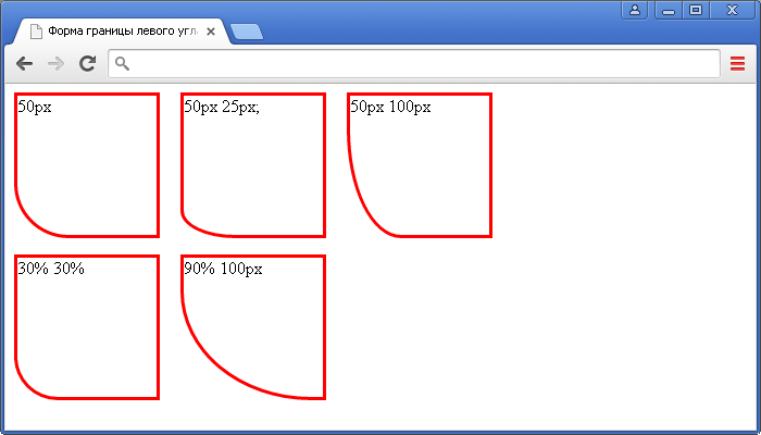
Установка формы границы нижнего левого угла элемента в CSS (свойство border-bottom-left-radius).CSS свойства
Сложные структуры css border
Существует множество техник для создания дизайна с применением сложных структур border. Для примера, разберем следующие…
Border-Style
Мы всегда используем наиболее известные свойства solid, dashed и dotted. Но существует парочка иных свойств border-style: groove и ridge.
border: 20px groove #e3e3e3;
Или в расширенном синтаксисе:
border-color: #e3e3e3;
border-width: 20px;
border-style: groove;
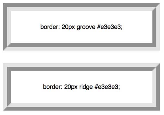
Хотя эти свойства и полезны, но они не являются основой создания сложных рамок.
Outline
Наиболее популярная техника создания двойной рамки – использование свойства outline.
.box {
   border: 5px solid #292929;
   outline: 5px solid #e3e3e3;
}
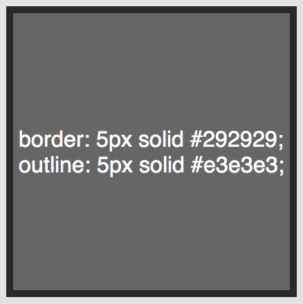
Этот способ работает отлично, хотя, он нас ограничивает только двумя рамками. Иногда бывает нужно создать градиентный border, который состоит из многих слоев… как тогда?
Псевдоэлементы
Когда техники outline не достаточно, альтернативным средством является использование псевдо элементов :before и :after. С помощью которых можно добавить дополнительные рамки к элементу:
.box {
  width: 200px; height: 200px;
  background: #e3e3e3;
  position: relative;

  border: 10px solid green;
}

/* Create two boxes with the same width of the container */
.box:after, .box:before {
  content: '';
  position: absolute;
  top: 0; left: 0; bottom: 0; right: 0;
}

.box:after {
  border: 5px solid red;
  outline: 5px solid yellow;
}

.box:before {
  border: 10px solid blue;
}
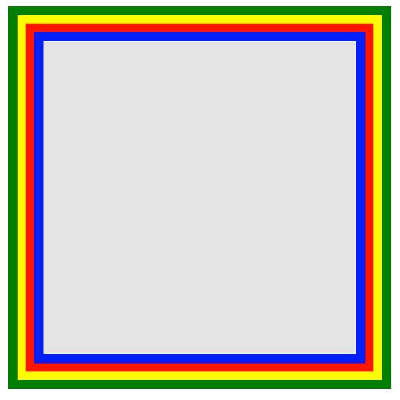
На вид не очень элегантно, но по крайней мере, это работает. Немного проблемно разобраться с последовательность цветов в рамках… но понять можно.
Box-Shadow
Интересным «детским способом» создания подобного эффекта, является использование CSS3 свойства box-shadow:
.box {
    border: 5px solid red;
     box-shadow:
       0 0 0 5px green,
       0 0 0 10px yellow,
       0 0 0 15px orange;
}
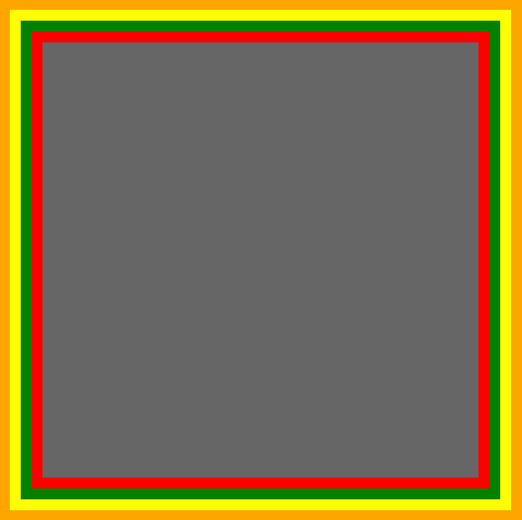
В этом случае мы были умнее, использовали специально предназначенное свойство box-shadow. Изменяя параметры x, y, blur на «нуль», мы можем использовать разные цвета для создания множества рамок.
Но есть проблемка, в старых браузерах, которые не понимают свойства box-shadow, будет видна только одна красная рамка в 5px.
«Помните! Дизайн сайта должен выглядеть кроссбраузерно, то есть одинаково во всех браузерах. Включая старые версии.»
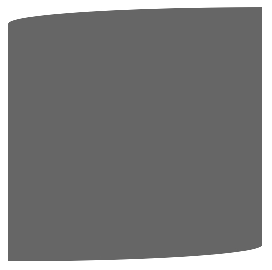
Изменяем углы
В дополнение к используемому простому значению border-radius, мы можем указать два отдельных – разделяя их через / мы укажем горизонтальный и вертикальный радиус.
Для примера:
border-radius: 50px / 100px; /* horizontal radius, vertical radius */
… это равносильно:
border-top-left-radius: 50px 100px;
border-top-right-radius: 50px 100px;
border-bottom-right-radius: 50px 100px;
border-bottom-left-radius: 50px 100px;
Эта техника подходит, для создания уникальных форм блоков. Для примера, вот создание эффекта завернутой бумаги:
.box {
    width: 200px; height: 200px;
    background: #666;

    border-top-left-radius: 15em 1em;
    border-bottom-right-radius: 15em 1em;

}
CSS Outline Style
The property specifies the style of the outline,
and can have one of the following values:
- — Defines a dotted outline
- — Defines a dashed outline
- — Defines a solid outline
- — Defines a double outline
- — Defines a 3D grooved outline
- — Defines a 3D ridged outline
- — Defines a 3D inset outline
- — Defines a 3D outset outline
- — Defines no outline
- — Defines a hidden outline
The following example shows the different values:
Example
Demonstration of the different outline styles:
p.dotted {outline-style: dotted;}
p.dashed {outline-style: dashed;}p.solid {outline-style: solid;}
p.double {outline-style: double;}p.groove {outline-style: groove;}
p.ridge {outline-style: ridge;}p.inset {outline-style: inset;}
p.outset {outline-style: outset;}
Result:
A dotted outline.
A dashed outline.
A solid outline.
A double outline.
A groove outline. The effect depends on the outline-color value.
A ridge outline. The effect depends on the outline-color value.
An inset outline. The effect depends on the outline-color value.
An outset outline. The effect depends on the outline-color value.
Note: None of the other outline properties (which you will learn more about in the next chapters) will have ANY effect unless the
property is set!
❮ Previous
Next ❯
CSS Reference
CSS ReferenceCSS Browser SupportCSS SelectorsCSS FunctionsCSS Reference AuralCSS Web Safe FontsCSS Font FallbacksCSS AnimatableCSS UnitsCSS PX-EM ConverterCSS ColorsCSS Color ValuesCSS Default ValuesCSS Entities
CSS Properties
align-content
align-items
align-self
all
animation
animation-delay
animation-direction
animation-duration
animation-fill-mode
animation-iteration-count
animation-name
animation-play-state
animation-timing-function
backface-visibility
background
background-attachment
background-blend-mode
background-clip
background-color
background-image
background-origin
background-position
background-repeat
background-size
border
border-bottom
border-bottom-color
border-bottom-left-radius
border-bottom-right-radius
border-bottom-style
border-bottom-width
border-collapse
border-color
border-image
border-image-outset
border-image-repeat
border-image-slice
border-image-source
border-image-width
border-left
border-left-color
border-left-style
border-left-width
border-radius
border-right
border-right-color
border-right-style
border-right-width
border-spacing
border-style
border-top
border-top-color
border-top-left-radius
border-top-right-radius
border-top-style
border-top-width
border-width
bottom
box-decoration-break
box-shadow
box-sizing
break-after
break-before
break-inside
caption-side
caret-color
@charset
clear
clip
clip-path
color
column-count
column-fill
column-gap
column-rule
column-rule-color
column-rule-style
column-rule-width
column-span
column-width
columns
content
counter-increment
counter-reset
cursor
direction
display
empty-cells
filter
flex
flex-basis
flex-direction
flex-flow
flex-grow
flex-shrink
flex-wrap
float
font
@font-face
font-family
font-feature-settings
font-kerning
font-size
font-size-adjust
font-stretch
font-style
font-variant
font-variant-caps
font-weight
grid
grid-area
grid-auto-columns
grid-auto-flow
grid-auto-rows
grid-column
grid-column-end
grid-column-gap
grid-column-start
grid-gap
grid-row
grid-row-end
grid-row-gap
grid-row-start
grid-template
grid-template-areas
grid-template-columns
grid-template-rows
hanging-punctuation
height
hyphens
@import
isolation
justify-content
@keyframes
left
letter-spacing
line-height
list-style
list-style-image
list-style-position
list-style-type
margin
margin-bottom
margin-left
margin-right
margin-top
max-height
max-width
@media
min-height
min-width
mix-blend-mode
object-fit
object-position
opacity
order
outline
outline-color
outline-offset
outline-style
outline-width
overflow
overflow-x
overflow-y
padding
padding-bottom
padding-left
padding-right
padding-top
page-break-after
page-break-before
page-break-inside
perspective
perspective-origin
pointer-events
position
quotes
resize
right
scroll-behavior
tab-size
table-layout
text-align
text-align-last
text-decoration
text-decoration-color
text-decoration-line
text-decoration-style
text-indent
text-justify
text-overflow
text-shadow
text-transform
top
transform
transform-origin
transform-style
transition
transition-delay
transition-duration
transition-property
transition-timing-function
unicode-bidi
user-select
vertical-align
visibility
white-space
width
word-break
word-spacing
word-wrap
writing-mode
z-index
CSS Outline Width — Ширина контура
Свойство задает ширину контура и может иметь одно из следующих значений:
- thin (типично 1px)
- medium (типично 3px)
- thick (типично 5px)
- Определенный размер (в px, pt, cm, em и т.д.)
В следующем примере показаны некоторые контуры с различной шириной:
thin контур.
medium контур.
thick контур.
4px контур.
Пример
p.ex1
{ border: 1px solid black;
outline-style: solid; outline-color: red;
outline-width: thin;
}p.ex2
{ border: 1px solid black;
outline-style: solid; outline-color: red;
outline-width: medium;
}p.ex3
{ border: 1px solid black;
outline-style: solid; outline-color: red;
outline-width: thick;
}
p.ex4
{
border: 1px solid black;
outline-style: solid; outline-color: red;
outline-width: 4px;
}
CSS Properties
align-contentalign-itemsalign-selfallanimationanimation-delayanimation-directionanimation-durationanimation-fill-modeanimation-iteration-countanimation-nameanimation-play-stateanimation-timing-functionbackface-visibilitybackgroundbackground-attachmentbackground-blend-modebackground-clipbackground-colorbackground-imagebackground-originbackground-positionbackground-repeatbackground-sizeborderborder-bottomborder-bottom-colorborder-bottom-left-radiusborder-bottom-right-radiusborder-bottom-styleborder-bottom-widthborder-collapseborder-colorborder-imageborder-image-outsetborder-image-repeatborder-image-sliceborder-image-sourceborder-image-widthborder-leftborder-left-colorborder-left-styleborder-left-widthborder-radiusborder-rightborder-right-colorborder-right-styleborder-right-widthborder-spacingborder-styleborder-topborder-top-colorborder-top-left-radiusborder-top-right-radiusborder-top-styleborder-top-widthborder-widthbottombox-decoration-breakbox-shadowbox-sizingbreak-afterbreak-beforebreak-insidecaption-sidecaret-color@charsetclearclipclip-pathcolorcolumn-countcolumn-fillcolumn-gapcolumn-rulecolumn-rule-colorcolumn-rule-stylecolumn-rule-widthcolumn-spancolumn-widthcolumnscontentcounter-incrementcounter-resetcursordirectiondisplayempty-cellsfilterflexflex-basisflex-directionflex-flowflex-growflex-shrinkflex-wrapfloatfont@font-facefont-familyfont-feature-settingsfont-kerningfont-sizefont-size-adjustfont-stretchfont-stylefont-variantfont-variant-capsfont-weightgridgrid-areagrid-auto-columnsgrid-auto-flowgrid-auto-rowsgrid-columngrid-column-endgrid-column-gapgrid-column-startgrid-gapgrid-rowgrid-row-endgrid-row-gapgrid-row-startgrid-templategrid-template-areasgrid-template-columnsgrid-template-rowshanging-punctuationheighthyphens@importisolationjustify-content@keyframesleftletter-spacingline-heightlist-stylelist-style-imagelist-style-positionlist-style-typemarginmargin-bottommargin-leftmargin-rightmargin-topmax-heightmax-width@mediamin-heightmin-widthmix-blend-modeobject-fitobject-positionopacityorderoutlineoutline-coloroutline-offsetoutline-styleoutline-widthoverflowoverflow-xoverflow-ypaddingpadding-bottompadding-leftpadding-rightpadding-toppage-break-afterpage-break-beforepage-break-insideperspectiveperspective-originpointer-eventspositionquotesresizerightscroll-behaviortab-sizetable-layouttext-aligntext-align-lasttext-decorationtext-decoration-colortext-decoration-linetext-decoration-styletext-indenttext-justifytext-overflowtext-shadowtext-transformtoptransformtransform-origintransform-styletransitiontransition-delaytransition-durationtransition-propertytransition-timing-functionunicode-bidiuser-selectvertical-alignvisibilitywhite-spacewidthword-breakword-spacingword-wrapwriting-modez-index
More Examples
Example
Set rounded corners for an element with a background color:
#rcorners1 { border-radius: 25px; background: #73AD21; padding: 20px; width: 200px; height: 150px; }
Example
Set rounded corners for an element with a border:
#rcorners2 { border-radius: 25px; border: 2px solid #73AD21; padding: 20px;
width: 200px; height: 150px; }
Example
Set rounded corners for an element with a background image:
#rcorners3 { border-radius: 25px; background: url(paper.gif); background-position: left top;
background-repeat: repeat; padding: 20px; width: 200px; height: 150px; }
Example
Also notice this:
#example1 { border-radius: 2em / 5em;}/* is equivalent to:border-top-left-radius: 2em 5em;
border-top-right-radius: 2em 5em;
border-bottom-right-radius: 2em 5em;
border-bottom-left-radius: 2em 5em; */#example2 { border-radius: 2em 1em 4em / 0.5em 3em;
}/* is equivalent to:border-top-left-radius: 2em 0.5em;
border-top-right-radius: 1em 3em;
border-bottom-right-radius: 4em 0.5em;
border-bottom-left-radius: 1em 3em; */
CSS Advanced
CSS Rounded CornersCSS Border ImagesCSS BackgroundsCSS ColorsCSS Gradients
Linear Gradients
Radial Gradients
CSS Shadows
Shadow Effects
Box Shadow
CSS Text EffectsCSS Web FontsCSS 2D TransformsCSS 3D TransformsCSS TransitionsCSS AnimationsCSS TooltipsCSS Style ImagesCSS object-fitCSS ButtonsCSS PaginationCSS Multiple ColumnsCSS User InterfaceCSS Variables
The var() Function
Overriding Variables
Variables and JavaScript
Variables in Media Queries
CSS Box SizingCSS Media QueriesCSS MQ ExamplesCSS Flexbox
CSS Flexbox
CSS Flex Container
CSS Flex Items
CSS Flex Responsive
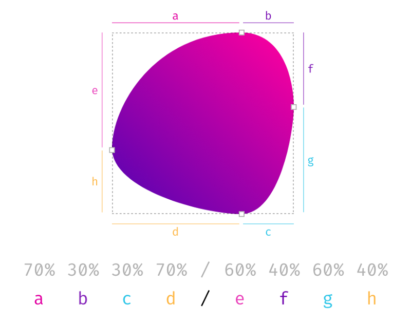
Восемь значений, разделённых косой чертой
Думаю, многие из вас уже попробовали всё, о чём мы говорили выше. Теперь настало время для по-настоящему интересных экспериментов. Что произойдёт, если значения разделить с помощью косой черты и указать до восьми таких значений? Для начала взглянем на . Она говорит нам о том, что если значения заданы до и после косой черты, тогда значения до косой черты задают горизонтальный радиус, а значения после — вертикальный. Если косой черты нет, то оба радиуса будут одинаковыми.
Итак, значения до косой черты ответственны за горизонтальные расстояния, а значения после косой черты — за вертикальные. Всё это хорошо, но тут возникает закономерный вопрос: «А о чём вообще идёт речь?». Помните процентные значения скругления углов, задаваемые для прямоугольных фигур? Там были применены разные абсолютные значения для вертикальных и горизонтальных расстояний и присутствовали асимметрично скруглённые углы. Именно такого эффекта можно добиться, используя косую черту при настройке .
Давайте сравним эффекты, которые дают следующие настройки: и . Результаты получатся очень разными.

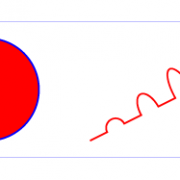
Симметричные углы левого элемента представляют собой четверть окружности, а асимметричные углы левого элемента являются частями эллипса
Если честно, фигуры, полученные в результате применения вышеописанных настроек, выглядят странновато. Однако не забывайте о том, что круги создаются с помощью таких параметров: . Круг получается из-за того, что два значения, задающие одну сторону, складываются и получается 100% (50% + 50% = 100%) и прямых линий от исходного квадрата не остаётся. Если порассуждать в том же духе о восьми значениях, используемых при задании свойства , то окажется, что с их помощью можно описать фигуру, которая похожа на гитарный медиатор или на клетку живого организма.
Фигура, полученная в результате применения 8 значений, разделённых косой чертой
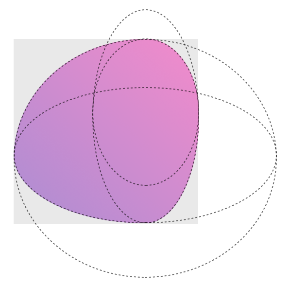
Четыре перекрывающихся эллипса, формирующих фигуру
Мне потребовалось некоторое время на то, чтобы к этому привыкнуть. Порой все эти конструкции бывает сложно осмыслить. Если вас привлекают сложные формы элементов, настраиваемые с помощью , можете воспользоваться этим небольшим инструментом.
Итоги
Теперь, когда вы знаете о том, что при настройке можно использовать 8 значений, то, вы, если попробовали вышеупомянутый инструмент, можете ощутить лёгкое разочарование, так как он не даёт возможности управлять каждым значением независимо. Если это так — то , специально для вас, его версия, поддерживающая независимую настройку всех восьми значений. Прежде чем вы им воспользуетесь — вспомните один разговор из фильма «Охотники за привидениями» 1984-го года:
— Не скрещивайте потоки.— Почему?— А то будет плохо.
Дело в том, что если вы переместите манипуляторы так, что они пересекутся на одной стороне фигуры, то она начнёт вести себя… Скажем так — она начнёт вести себя непредсказуемо. Да что там говорить — сами. В конце концов, это не приведёт к вселенской катастрофе, но, делая это, помните о том, что мы вас предупредили.
Перевод статьи CSS Border-Radius Can Do That?
CSS Properties
align-contentalign-itemsalign-selfallanimationanimation-delayanimation-directionanimation-durationanimation-fill-modeanimation-iteration-countanimation-nameanimation-play-stateanimation-timing-functionbackface-visibilitybackgroundbackground-attachmentbackground-blend-modebackground-clipbackground-colorbackground-imagebackground-originbackground-positionbackground-repeatbackground-sizeborderborder-bottomborder-bottom-colorborder-bottom-left-radiusborder-bottom-right-radiusborder-bottom-styleborder-bottom-widthborder-collapseborder-colorborder-imageborder-image-outsetborder-image-repeatborder-image-sliceborder-image-sourceborder-image-widthborder-leftborder-left-colorborder-left-styleborder-left-widthborder-radiusborder-rightborder-right-colorborder-right-styleborder-right-widthborder-spacingborder-styleborder-topborder-top-colorborder-top-left-radiusborder-top-right-radiusborder-top-styleborder-top-widthborder-widthbottombox-decoration-breakbox-shadowbox-sizingbreak-afterbreak-beforebreak-insidecaption-sidecaret-color@charsetclearclipclip-pathcolorcolumn-countcolumn-fillcolumn-gapcolumn-rulecolumn-rule-colorcolumn-rule-stylecolumn-rule-widthcolumn-spancolumn-widthcolumnscontentcounter-incrementcounter-resetcursordirectiondisplayempty-cellsfilterflexflex-basisflex-directionflex-flowflex-growflex-shrinkflex-wrapfloatfont@font-facefont-familyfont-feature-settingsfont-kerningfont-sizefont-size-adjustfont-stretchfont-stylefont-variantfont-variant-capsfont-weightgridgrid-areagrid-auto-columnsgrid-auto-flowgrid-auto-rowsgrid-columngrid-column-endgrid-column-gapgrid-column-startgrid-gapgrid-rowgrid-row-endgrid-row-gapgrid-row-startgrid-templategrid-template-areasgrid-template-columnsgrid-template-rowshanging-punctuationheighthyphens@importisolationjustify-content@keyframesleftletter-spacingline-heightlist-stylelist-style-imagelist-style-positionlist-style-typemarginmargin-bottommargin-leftmargin-rightmargin-topmax-heightmax-width@mediamin-heightmin-widthmix-blend-modeobject-fitobject-positionopacityorderoutlineoutline-coloroutline-offsetoutline-styleoutline-widthoverflowoverflow-xoverflow-ypaddingpadding-bottompadding-leftpadding-rightpadding-toppage-break-afterpage-break-beforepage-break-insideperspectiveperspective-originpointer-eventspositionquotesresizerightscroll-behaviortab-sizetable-layouttext-aligntext-align-lasttext-decorationtext-decoration-colortext-decoration-linetext-decoration-styletext-indenttext-justifytext-overflowtext-shadowtext-transformtoptransformtransform-origintransform-styletransitiontransition-delaytransition-durationtransition-propertytransition-timing-functionunicode-bidiuser-selectvertical-alignvisibilitywhite-spacewidthword-breakword-spacingword-wrapwriting-modez-index
CSS Outline Color — Цвет контура
Свойство используется для установки цвета контура.
Цвет может быть установлен с помощью:
- name — указания названия цвета, например «red» (красный)
- RGB — указания значения RGB, например «rgb(255,0,0)»
- Hex — указания значения HEX, например «#ff0000»
- invert — выполняется инверсия цвета (которая обеспечивает видимость контура независимо от цвета фона)
В следующем примере показаны несколько разных контуров с разными цветами
Также обратите внимание, что эти элементы также имеют тонкую чёрную рамку внутри контура:. Сплошной красный контур
Сплошной красный контур.
Двойной зеленый контур.
Наружный желтый контур.
p.ex1
{
border: 1px solid black;
outline-style: solid;
outline-color: red;
}p.ex2
{
border: 1px solid black;
outline-style: double;
outline-color: green;
}p.ex3
{
border: 1px solid black; outline-style: outset;
outline-color: yellow;
}
В следующем примере используется , который выполняет инверсию цвета. Это гарантирует, что контур будет виден независимо от цвета фона:
Сплошной перевернутый (инверсный) контур.
Как скруглить углы в HTML через CSS
Рассмотрим примеры скругления углов через CSS. Например
В этом случае все 4 края элемента будут скруглены по 30px.
Значение скругления означает то, какой радиус окружности должен быть в уголке.
Можно скруглять каждый угол с разными радиусами. Для этого нужно написать
Последовательность этих цифр следующая:
- Верхний левый угол (в примере это 10px)
- Верхний правый угол (в примере это 7px)
- Нижний правый угол (в примере это 0px)
- Нижний левый угол (в примере это 0px)
Например
Результат:
Чтобы не запоминать какое значение за каким идет можно писать в CSS в отдельности каждый угол
Помимо этого, можно также изменять и радиус для каждого угла в отдельности для горизонтальной и вертикальной плоскостей.
Задание второго радиуса нужно задавать через слэш «/» в случае border-radius или вторым значением рядом в случае прямого указания каждого угла радиуса
Первый параметр отвечает за горизонтальный радиус, второй за вертикальный.
Например, с помощью этих свойств можно сделать эллипс:
Результат:
Примечание
Значения 100px 100px 100px 100px / 200px 200px 200px 200px можно было бы написать еще компактнее:
Изменяя параметры каждого из углов, можно сделать различные интересные скругленные элементы. Например, можно сделать круг, эллипс, каплю, камень, яйцо и т.п.
CSS Outline Style — Стиль контура
Свойство задает стиль контура и может иметь одно из следующих значений:
- — Определяет точечный контур
- — Определяет пунктирный контур
- — Определяет сплошной контур
- — Определяет двойной контур
- — Определяет трехмерный (3D) желобчатый контур
- — Определяет трехмерный (3D) ребристый контур
- — Определяет 3D-внутренний контур
- — Определяет 3D-наружный контур
- — Определяет отсутствие контура
- — Определяет скрытый контур
В следующих примерах показаны разные значения :
Точечный контур.
Пунктирный контур.
Сплошной контур.
Двойной контур.
Контур канавки (желобка). Эффект зависит от значения цвета контура.
Контур гребня. Эффект зависит от значения цвета контура.
Контур врезки. Эффект зависит от значения цвета контура.
Наружный контур. Эффект зависит от значения цвета контура.
Пример
Демонстрация различных стилей контура:
p.dotted {outline-style: dotted;}
p.dashed {outline-style: dashed;}p.solid {outline-style: solid;}
p.double {outline-style: double;}p.groove {outline-style: groove;}
p.ridge {outline-style: ridge;}p.inset {outline-style: inset;}
p.outset {outline-style: outset;}
Примечание: Ни одно из других свойств контура не будет иметь никакого эффекта, если не установлено свойство !
CSS Properties
align-contentalign-itemsalign-selfallanimationanimation-delayanimation-directionanimation-durationanimation-fill-modeanimation-iteration-countanimation-nameanimation-play-stateanimation-timing-functionbackface-visibilitybackgroundbackground-attachmentbackground-blend-modebackground-clipbackground-colorbackground-imagebackground-originbackground-positionbackground-repeatbackground-sizeborderborder-bottomborder-bottom-colorborder-bottom-left-radiusborder-bottom-right-radiusborder-bottom-styleborder-bottom-widthborder-collapseborder-colorborder-imageborder-image-outsetborder-image-repeatborder-image-sliceborder-image-sourceborder-image-widthborder-leftborder-left-colorborder-left-styleborder-left-widthborder-radiusborder-rightborder-right-colorborder-right-styleborder-right-widthborder-spacingborder-styleborder-topborder-top-colorborder-top-left-radiusborder-top-right-radiusborder-top-styleborder-top-widthborder-widthbottombox-decoration-breakbox-shadowbox-sizingbreak-afterbreak-beforebreak-insidecaption-sidecaret-color@charsetclearclipclip-pathcolorcolumn-countcolumn-fillcolumn-gapcolumn-rulecolumn-rule-colorcolumn-rule-stylecolumn-rule-widthcolumn-spancolumn-widthcolumnscontentcounter-incrementcounter-resetcursordirectiondisplayempty-cellsfilterflexflex-basisflex-directionflex-flowflex-growflex-shrinkflex-wrapfloatfont@font-facefont-familyfont-feature-settingsfont-kerningfont-sizefont-size-adjustfont-stretchfont-stylefont-variantfont-variant-capsfont-weightgridgrid-areagrid-auto-columnsgrid-auto-flowgrid-auto-rowsgrid-columngrid-column-endgrid-column-gapgrid-column-startgrid-gapgrid-rowgrid-row-endgrid-row-gapgrid-row-startgrid-templategrid-template-areasgrid-template-columnsgrid-template-rowshanging-punctuationheighthyphens@importisolationjustify-content@keyframesleftletter-spacingline-heightlist-stylelist-style-imagelist-style-positionlist-style-typemarginmargin-bottommargin-leftmargin-rightmargin-topmax-heightmax-width@mediamin-heightmin-widthmix-blend-modeobject-fitobject-positionopacityorderoutlineoutline-coloroutline-offsetoutline-styleoutline-widthoverflowoverflow-xoverflow-ypaddingpadding-bottompadding-leftpadding-rightpadding-toppage-break-afterpage-break-beforepage-break-insideperspectiveperspective-originpointer-eventspositionquotesresizerightscroll-behaviortab-sizetable-layouttext-aligntext-align-lasttext-decorationtext-decoration-colortext-decoration-linetext-decoration-styletext-indenttext-justifytext-overflowtext-shadowtext-transformtoptransformtransform-origintransform-styletransitiontransition-delaytransition-durationtransition-propertytransition-timing-functionunicode-bidiuser-selectvertical-alignvisibilitywhite-spacewidthword-breakword-spacingword-wrapwriting-modez-index
CSS Outline Style
The property specifies the style of the outline,
and can have one of the following values:
- — Defines a dotted outline
- — Defines a dashed outline
- — Defines a solid outline
- — Defines a double outline
- — Defines a 3D grooved outline
- — Defines a 3D ridged outline
- — Defines a 3D inset outline
- — Defines a 3D outset outline
- — Defines no outline
- — Defines a hidden outline
The following example shows the different values:
Example
Demonstration of the different outline styles:
p.dotted {outline-style: dotted;}
p.dashed {outline-style: dashed;}p.solid {outline-style: solid;}
p.double {outline-style: double;}p.groove {outline-style: groove;}
p.ridge {outline-style: ridge;}p.inset {outline-style: inset;}
p.outset {outline-style: outset;}
Result:
A dotted outline.
A dashed outline.
A solid outline.
A double outline.
A groove outline. The effect depends on the outline-color value.
A ridge outline. The effect depends on the outline-color value.
An inset outline. The effect depends on the outline-color value.
An outset outline. The effect depends on the outline-color value.
Note: None of the other outline properties (which you will learn more about in the next chapters) will have ANY effect unless the
property is set!
❮ Previous
Next ❯